


.png)
 - Vertical.png)
.png)
 - Vertical.png)
.svg)
.png)
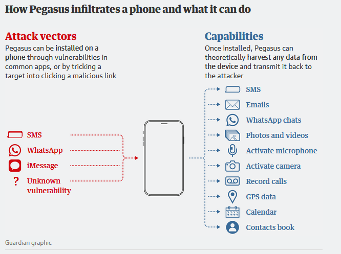
How to Make a Font
Terminology
Typeface: The character list
Font: A typeface at a given size and weight
Font Family: Typeface at varying weights
Weight: Bold, Regular, Thin, etc.
Character: A single element of a font
Glyph: The representation(s) of a given character.
Styles
Serif, Sans Serif, Slab Serif
Antiqua/Old Style/Black Text
Cursive: Joined handwriting typefaces
Script: More formal than cursive
Variations
Condensed
Italic: Redesign of Roman typeface, not merely slanted
Weights
Roman: Regular weight of a typeface
Views
Oblique/Slanted: Tilted standard typeface
Design
Body: Invisible space occupied by a character
Axis/Stress: Line drawn through the middle of a character, from it's thinnest top and bottom point (in a serif O)
Baseline
Ascender
Descender
Cap Height
x-Height/Midline
Kerning: Design level letter spacing, dictates how far individual letters are spaced from one another
Typesetting
Tracking/Letter Spacing: Adjustment done in web design / typesetting where the spacing is adjusted aside from default kerning
Leading/Line Spacing: Spacing between lines
Word Spacing: Distance between two words
Rendering
Rasterization - involves Anti-Aliasing and Hinting
CSS
Units
Absolute Units:
cm
in
pc = pixel
pt = 1/12th of a px
Relative Units:
px: Magical unit that adjusts to screen size
em: Relative width of the point size
ex: Relative to the x-height
Variables
font-size
line-height
letter-spacing
font-kerning (Usually specified in quality fonts)
Tips
- Create a brief for what you want out of the font
- Design font on paper first
- Use control characters to help design (lowercase=n, o; uppercase=H, O)
- Switch to PC by uploading your sketch
- Use a font editor and create the glyphs
- Test the font in typing mode, at different sizes and in paragraphs
Kerning
- You have to kern each letter individually
- Kerning is all about feeling
- Test kerning when size changes
- Practice Game: https://type.method.ac/
- Letters to keep an eye on
- Slanted Letters: A, K, V, W, Y
- Letters with arms or cross-strokes: F, T, L
- Letter combinations: W or V + A; F or T + a lowercase vowel
- Two straight lines need the most space: II > IO > OO
- Try flipping the letters upside down, so you can see the spaces unbiased
Hinting
Happens automatically, but can be set manually in font editors with TrueType instructions
e.g. SNAGW (Set Angle Weight), MDAP (Move Direct Absolute Point)
Design Basics
-
Words must be spaced more than letters, to form distinct units.